What does a Garden Gnome do when she is not gardening, in the kitchen or doing genealogy? Well the answer might just surprise you so read the entries to find out more. This blog focuses on everything we do to make our house a home. There will be a strong emphasis on home energy efficiency and do-it-yourself (DIY) projects. At the same time there will also be crafts, knitting and crocheting projects along with any other little tips we do to create that down to earth, I want to be here home. Please enjoy your visit :)
Paint Chips
We are home now and the holidays are over so it is time to turn our attention to getting a bit of decorating done. We had deep
crown moulding installed in the entrance, greatroom and hallway back in November before we returned to our vacation home. The crown moulding still needs painting. I'm rather partial to a pale grey for the walls with white trim. I'm currently looking for just the right grey.
I brought paint chip samples home to see how they would look in the intended rooms. These are Behr paint chips but our Home Hardware does colour match so can mix to Behr paint chips. The one that I was immediately attracted to in the store (second from left) has a bit too much blue tone while the far right one has a green tone. The second chip from the bottom of the far left sample is close to what I want but not quite.
I'm planning on doing the painting prep work next week so that gives me the weekend to find a paint colour. This will be a big project but the walls are in excellent conditions so there isn't a lot of repair work to do. We will be replacing the doors in the hallway, the door trim and baseboard as well. This should be a fun project!
I tend to use acrylic laytex paint whenever possible. While this paint is not as low odour as the newer eco-friendly paints with no VOCs, it has a lot lower odour than oil based enamel paints. I have extensive experience with the acrylic laytex paints, limited experiences with enamel paints and no experience with the eco-friendly paints. My winter project is painting every room in the house and given my druthers I would have tried the eco-friendly paints except my local Home Hardware has had no feedback at all on these paints other than they are not selling well. So I went with the tried and true Beautitone acrylic laytex paint.
Acrylic laytex paints are wonderful to work with and they are easy to clean-up but there is still a smell. Unfortunately the odour can bother those like me with sinus and asthma, more so when the windows can't be opened to rid the house of the odour. I use two techniques to help rid the house of acrylic latex paint odour:
- exhaust fans - An exhaust fan can be quite beneficial in removing odour from painting. This can be quite effective at removing odour during the painting process. The downside to using exhaust fans is they suck out the heat along with the odour.
- a bowl of vinegar - A bowl of white vinegar neutralizes the paint odour. Place a bowl with about an inch of white vinegar in the room while painting and leave it there a couple of days. It really does help.
Garden Gnome
©2006-2012
I have spent the last couple of weeks getting close and personal with paint. My winter project is to paint the entire interior of our new home. The main bathroom was first and is completed with the exception of the custom made trim for the tub recess. Last Monday I started the kitchen that was originally supposed to be a pale taupe but thanks to my husband is now the same colour as our dinnerware, a deep and rich burgundy. After almost a full week of working on the kitchen, I'm exhausted. The room is turning out to be absolutely gorgeous (pictures to come shortly) but talk about a major pain in the keester! The real problem lies with the red paint itself.
Paints colours are mixed in a base of clear, white, medium or dark. Now the bathroom, a pale taupe mixed in a base of white covered nicely in two coats. The burgundy in the kitchen was mixed in a base of clear. The result was a thinner paint taking three coats to cover. Red in general when it comes to paint is just a royal pain. It needs a grey base coat primer if going over lighter colours and don't even think about skipping the primer unless you want to paint the walls about ten times. It really is not a good choice of colour for any area that will receive a lot of light as for some reason the red pigment is very, very prone to fading. Getting a nice, clean line is almost enough to pull your hair out as well. So a room that should technically have taken two days has taken me six days and there is still another two good days of work in the kitchen putting me a bit behind schedule for my winter project. Knowing how DIY projects go that two days will stretch out to four days.
Garden Gnome
©2006-2012

As soon as we knew we were moving here, one of our friends suggested as they did, have a professional painter come in and paint everything neutral. Well, we actually like some of the colours so decided against this. However, I have always maintained that you should not immediately change paint colours upon moving into a new home. Get settled first then observe how the natural light affects the room colours. Chances are the nice creamy yellow in the kitchen was quite welcoming under artificial lighting when you viewed the house and now is a bit garish while sipping your morning coffee.
I spent a couple of days on the Behr ColorSmart site. This is an amazing tool that can help you find the perfect colours and even shows you what they will look like using your own photo. After finding a mossy green (Promenade, 400F-5) very close to what was used in the master bedroom and fairly close to one of the colours at our vacation home. All the other colours in the house will co-ordinate back to that green. My husband wanted to deal locally at Home Hardware but they don't sell Behr paint. Home Depot does but that means a good half hour drive each way that will waste a lot of time if I go on a per room basis. Anyway, Home Hardware can mix the paint to the Behr code so that is a real bonus for me! It will save countless trips outside of our community.
Another great way to choose a colour for a room is to look at one of the fabrics you already have in there. Squint and the predominate colour will pop out. Take the fabric sample with you to start building of colours that will co-ordinate with that fabric. I actually chose co-ordinating colours this way for our old house. I loved the tone of the existing wallpaper but not the design or age of it. The end result was quite pleasant to the point I ended up basing the entire house colours on that particular colour! I even found a wallpaper border later with all the colours. The neat thing was I had chose the colours for the walls using the squint method and the Behr ColorSmart tool well before I ever found the border and yet the border matched perfectly. Sometimes working backwards still gets good end results!
Garden Gnome
©2006-2012
Our new house was built in 1994. It is a 5-bedroom executive house that we moved into in September of 2011. We really liked the room colours with the exception of two when we did the walk-throughs but after five months of living here I think I have noticed every single painting flaw in the house. The colours are almost but not quite co-ordinated and the previous owners tried to use a three colour shadowing technique in the entrance/living/diningroom/hall unsuccessfully. Then the warm taupe tones in that space clashes with the cooler taupe in the kitchen. In fact the cooler taupe in the kitchen really doesn't work as well as it could with the warm oak, ceramic tile (counters) or marble tile (floor) tones. The visual aspect could have been overlooked but what could not be overlooked was the amateur painting! My massive winter project is painting each room in the house. Over the next few weeks I will be doing a bit of blogging about that.
Garden Gnome
©2006-2012
Our new real estate agent pointed out a couple of areas where a bit of touch-up paint would go a log ways. The main area was the stairs leading to the sunporch. We boughht $60 worth of supplies including two colours of paint and set to work knowing the weather was against us. As we worked on the staircase I looked around for other small projects to do a bit of touch-up paint on just to spiffy them up a bit for showing the house.
What ends up happening when living in a house for any length of time is you tend to overlook some of those little things that need doing. The underneath of the railing might need a bit of touch-up paint or the railing itself might be showing a few dull or rusting spots but because the railing is so familiar you don't really notice it. These are the little things that potential buyers will notice when walking through your home and surprising a little thing can be a deal breaker. We had one potential buyer not put in an offer the first time around because the staircase needed paint. The reality is with materials it cost us under $30 since we used less than half the paint and it took us 2 days or about 4 hours of time maximum and yet because that staircase wasn't painted we did not get an offer from them. Yes it sounds petty but that is the market at the moment. Buyers are making demands and in some cases almost unreasonable demands because it is a buyers' market and they know it.
As a seller that means you have to anticipate and ward off these demands by doing a bit of touch-up painting. Take a walk through your house looking at the way a buyer would see it. If that isn't working get a friend or family member to do a walk through. A fresh set of eyes can make a huge difference because they will see those little things you don't.
Garden Gnome
©2006-2010
Painting in Progress
November 1, 2010
Our listing agent recommended painting the
staircase to the sunporch. This echoed our previous listing agent's advice but with ending the listing and going on vacation we didn't get around to it. When it was mentioned again, I put out an SOS to one of our kids who picked up the paint on Monday and prepped the staircase. I started paint the same day. We are now working against the weather but think it can still be finished by Thursday. Pictured is the first coat of white paint going on the staircase. I must say it does make a difference! In all honesty this project should have been done quite some time ago but we got wrapped up in other projects that needed being done sooner.
Garden Gnome
©2006-2010
The sunporch above the lower level covered patio has an entrance from the outside. This gives a bit more versatility than just having an entrance from the inside. I've decided the next house project will be sprucing up this stair case. It is quite solid so there are no structural issues but it in need of a good cleaning and updated painting.

The original paint colours for the house is black and white which I feel are just a bit too harsh against our brick. The problem is we have both wood and aluminum trim (facia, soffets, some window trime) and three older replacement windows and 2 sets of patio doors that are white. I would like to move towards a taupe and green colour scheme for outside trim features. This presents a bit of a problem. We could replace all the older replacement windows with wood inside/outside windows to match the rest of the house then paint the colour of choice or I can figure out a way to work with the white. The old fashioned white and dark green combination is one option. I'm wondering if white and taupe would work together as well leaving the dark green or blue as the accent colours for the doors. At any rate the black is just too harsh so that is definitely out.
I also don't like the rubber stair treads. Painted stairs can be slippery so I understand the need for traction. I saw a product that can be sprinkled onto wet paint that will give the step traction without the need for treads. I would also like to add some type of lighting feature as there is no outdoor lighting to light up the staircase. Rope lighting is one option going under the railing lip or around the underneath of the landing. Another option is to install a fixture at the top of the door. So we have a few decisions to make. We've started the prep work but the humidity levels are to high to do any painting which gives a few days to decide on lighting and colours.
Garden Gnome
©2006-2010
The sad thing about selling your home is all of a sudden you become extremely critical of every single little detail. All those little things that you've lived with and overlooked become the things you focus on. In most cases they cost little to fix, take little time to fix but somehow got overlooked because other repairs and maintenance became a higher priority. I keep thinking what a shame we didn't just get to the little things like replacing or paint vent covers, changing out electrical outlets and changing out those ugly light fixtures earlier so at least we could have enjoyed them while we were here. Ah well, live and learn.
 Painted
Forced air heating/air conditioning (HVAC) have two types of vents. The larger vent covers are for the cold air return. As cold air settles near the floor it is drawn back into the heating system to be heated then returned through the smaller heat vents. Any vent cover on a vent that comes up through the floor takes a fair amount of abuse. Metal vent covers will get scratched and/or bent from walking on or being hit by furniture. They develop rust in areas where they get wet.
If the vent cover is in good condition and not bent, remove it and wash well. Dry well. Remove any rust spots with steel wool then use a tack cloth to any dust. Place the cover right side up on top of a cardboard box in a sunny location outside. Spray with alkyd enamel paint. Let dry then spray on a second coat. Let dry well then put the vent cover back into its place. This is a very low cost way to spruce up metal vent covers and one that can easily be done anytime needed or if you want to custom match a vent colour to a room.
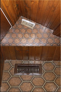 Plastic
The downside to sprucing up the details is you find more things that need to be sprucing up. I decided the vent cover (top) in the entrance hall needed to be replaced so used a plastic cover (bottom). The downside to plastic is they only come in certain colours but there is Krylon spray paint available for painting plastic. I don't know how well it would work on plastic vent covers.
The replacement vent cover highlights the flooring issue. The kicker here is we have ceramic tile sitting in the garage ready to tile the floor except waiting for weather we can do this as it would put the side door out of commission for at least a weekend. The realtor said not to worry about doing the tiling so I will be onto plan B.
I'm going to strip the floor using household ammonia to remove all the wax build-up. I know there is a wax build-up because any standing water leaves white marks. Once the wax is removed I will use a liquid wax to bring up the shine. The floor itself is in good condition just a bit dated so hopefully this will make the entrance look good for showing.
Garden Gnome
©2006-2010
Painting involves both prep and clean-up tasks. One of our kids and a friend volunteered to paint the room that was planned to be the craft room. The interesting thing about someone else doing something you normally would is you get to see a few other methods that work just as well as your methods. My designated painter has actually spent a summer painting during their college years so I thought everything was in good hands and honestly the room looked wonderful just with the first coat of paint on the ceiling. Checking the room I discovered a paint tray with drying paint in it. Now normally I would have washed out the pain cleaning the tray with the left-over paint going down the drain. They told me not to do this.
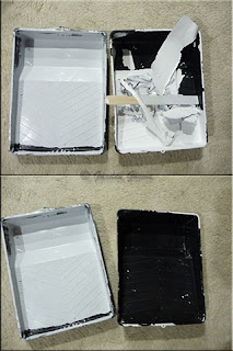 Before & After
The trays were plastic so they said to leave the paint to dry then pull the dried paint off. The premise is the paint is not going down the drain and the dried paint can be tossed into the garbage with less mess and fuss. I was skeptical but they continued to use this method finally leaving me with two trays to clean up.
Pictured are the two trays with the paint in the process of being pulled off of one tray (top). A quick twisting motion loosens the pain making it peel away from the plastic quite easily. It took me about 5 minutes to fully clean the first tray (bottom). I seriously could not believe how easy this method of cleaning the paint trays was! There was no muss, no fuss. The paint just easily peels off the trays.
I don't know if this method would work using an oil based paint but suspect it would. It definitely works with latex based paint. The real trick seems to be the plastic trays. I know you can buy plastic paint tray liners and some people simply line the tray with a plastic bag, but this method eliminates using any liners. I don't think it will work using a metal paint tray. At any rate give it a try the next time you are painting and see what you think.
Garden Gnome
©2006-2010
If you recall, we tore apart a spare room to turn into a craft room a day before getting news that would set in motion major life changes. As a result our house is currently up for sale. While this was discouraging as far as creating a craft room our minds are already with the new houses. Unfortunately we could not leave the room in limbo so decided to go ahead and finish it.
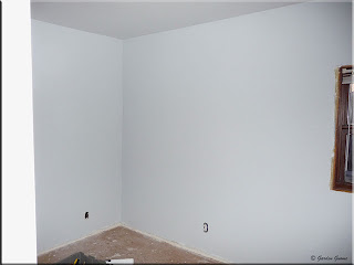 Painted
I think the room looks wonderful painted! The colours came out as I wanted so no complaints there. We are putting new trim around the windows and will be installing a laminate flooring along with new baseboard. We will also be replacing the electrical outlets just to make things look nicely finished. This will at least show this room nicely. Watch for a bit more on that as I will post our progress.
It is very important especially when trying to sell your home to have each room show the best possible. We could have left the room as is and explained but this way it will show nicely. If listed with a realtor we will likely stage this room to look like the third bedroom it is supposed to be. At best you will re-coup any costs for updating the room and at worst if you don't sell the room still looks great!
Garden Gnome
©2006-2010
Oh my gosh so much has happened since my last update here regarding converting a spare bedroom to a craft room. The same day we painted the ceiling in the soon to be craft room my husband got a phone call that has thrown our lives into a huge but exciting turmoil. As a result of that great purchase (more to come once everything is finalized) we decided to sell our current home privately. If that doesn't work within a couple of weeks we will list our house with a realtor. Essentially what we are doing is taking one house and turning it into two. We have found a house we want and have an accepted conditional offer. So we are now in the process of showing our home which means quickly finishing up the room that was going to be my craft room. Don't worry though as our new house will have the craft room so you will be able to watch that progress as well as a lot more!
 Painted
Paint has to be one of my favourite mediums to work with. There is just so much you can do with it without breaking the bank. Since this room was intended to be a craft room I wanted rather neutral colours that would not cast overtones on my craft projects. I also wanted light colours to make the room seem bigger and brighter. I went with a bright white for the ceiling and a light dove grey for the walls. What a difference the paint makes! I couldn't help but get excited as the improperly faux paint finish was covered up. I can't wait to see what the room looks like with a new floor! Unfortunately we won't get to enjoy the room ourselves but we will happy knowing someone else will enjoy it.
Garden Gnome
©2006-2010
I love crafts so generally have several projects on the go at one time. Aside of textiles one of my favourite mediums to work with is paint. Several years ago I discovered thin unfinished band boxes suitable for decorative painting or decoupaging. At that time they weren't exactly cheap. A couple of years ago I rediscovered unfinished boxes at of all places a dollar store! These are not the wood boxes of the past!
 Decorative Wood Boxes
Pictured are two wood boxes purchased at a dollar store for $1. The hexagon box is unfinished to show you what the finished box looked like when I bought it. The boxes are about 6" in length, 4" wide and 3" deep. They come with hinged lids and a small clasp. The hinges and clasp are brass coloured. The pressed raised design in the centre is recessed and leaves a lot of ways to finish it.
I wanted a quilted look for the finished box so painted the raised design with acrylic craft paints that are also available at dollar stores. I used tole painting a type of folk art for the inside panel. When the inside panel was dry, I used 3 coats of water based urethane to finish the box. There is still plenty of time to make up a few of these decorative wood boxes for gift giving.
The most expensive part of this project is the water based urethane but you can easily finish four or more boxes using one small can. You can use either spray or brush on urethane in satin or gloss finish. You will need a few bottles of Crafter's Acrylic paint in various colours but at $1 a piece for a 55 ml (2 oz) bottle they will last for several crafting projects and can be used on a wide variety of surfaces. Don't let the shading scare you either. It is rather easy simply by applying the base coat of paint then stroking on a little white while the base coat is still damp using a semi dry brush. Artists brushes are also available at the dollar stores.
I hope you like this inexpensive gift idea and have a lot of fun creating these cute decorative boxes. They are perfect for gift giving as is or filled with something special. Another way you can gift these boxes is to create a kit with everything needed to finish the box for the crafter on your list.
Materials Needed
decorative hinged wood box
Crafter's Acrylic paint (variety of colours)
sheet fine grade sandpaper
artist brush(es)
½" sponge brush (only if using brush on finish)
Flecto® Varathane
newspaper to protect surface
Garden Gnome
©2006-2008
Please Note: I will do a post when the kitchen renovation is finished with the total cost and brand names used.
The kitchen cabinets are coming along nicely. It's been one week today since I started. I had hoped to be a bit further ahead than what I am but still things are progressing. The drawers are finished, a few of the cabinet fronts are finished while the rest are in various stages ranging from untouched to the first coats of polyurethane. Weather has been a factor as the cabinet doors are being sanded outside then stained and sealed in the garage. Unfortunately we have had a couple of rainy days where I couldn't sand outside and the moist air slowed the stain drying. Another problem has been copious amounts of small white fuzzy pollen in the air slowing down spray finishing and triggering my asthma. All things considered, I'm pretty much on schedule. I had hoped to have the cabinets completed by Saturday, just under the two week mark. That may still be possible.
 Refinished vs Old
It was very important to me to get the cabinet fronts to blend in with the existing wood while keeping the cabin feel of the house. Painting the cabinets would have given the option of updating the handles but was not an option due to the design of the kitchen opening onto the family room divided only by the small breakfast bar and floor. Pictured is a refinished verses the old finish cabinet door fronts. As you can see the stain I chose is a bit closer to the wainscoting than the original finish. You can also see that marks from the original handles are still apparent. I chose a spray on satin polyurethane for the finish so even though it shows a bit of shine from the flash there really isn't much shine. The satin finish blends in nicely with the existing wood wainscoting and ceiling.
 Old vs Painted Handles
I decided to work with the existing handles instead of replacing them. While this was the easiest solution to covering the marks left behind on the cabinet doors, it also ended up being a practical, money saving solution. At the same time it was an environmentally friendly solution to re-use instead of replace. Had I been replacing I would have went with something black metal and rustic.
I scrubbed the handles then dried them good. To be sure there was no water in remaining in any cracks, I sat the handles in the sun for a couple of hours. Spray painting the handles was very easy. I used Beauti-Tone Interior/Exterior Acrylic Enamel spray paint in gloss black. I lined up all the handles on a piece of cardboard then simply sprayed keeping the spray paint can in motion. This is important when using spray paint to prevent running and sagging paint. It only took about 2 minutes to spray all the handles. Preparing the handles and dry time is the time consuming part.
I'm quite pleased with the look of the handles. The before picture shows how the handles would have looked on a refinished door had I left them as is. When the handles were together there were noticeable differences in the colour of the brass ranging. There were three colours! Some were a pale yellowish brass, some were a nice medium brass and a few were an orangish brass. I suspect they were different lots but the difference could have been caused by exposure to some cleaning agent. The after picture shows a painted handle on the same door. I was quite nervous using a gloss paint as glitter and excessive shine looks a bit out of place. Still, I went ahead figuring if the shine was too much I could tone it down with a coat of the satin spray polyurethane but I liked the way they came out. The gloss is not overpowering at all.
Garden Gnome
© 2007
When we moved here last year we knew right off the bat that both bathrooms would need complete gutting and there would a kitchen renovation to fit our appliances, replace the countertop and backsplash and while not replacing the cabinets the cabinet doors and hardware would likely be replaced. So inside we knew we were facing some rather expensive changes. But what about the other rooms? Upstairs while gorgeous had very dated wallpaper in dirty taupe tones. The larger upper bedroom had deep rose with metallic gold floral wallpaper I actually like but according to everyone else it looks like a bordello. The smaller upper bedroom was poorly painted in two tone faux feather method. The dominant feature throughout the house is wood and lots of it with the family room and kitchen having wood wainscotting and wood beamed ceilings. The stairwell is wood. Aside of wood the next dominant feature in the family room is a floor to ceiling fieldstone fireplace. The challenge would be to keep the cottage feel while highlighting the wood and because of the design of the house keep the colours flowing nicely.
Freshening up the look of a room or giving it a whole new look is oh so easy and inexpensive with paint. It is the ultimate DIY project. If you don't like the results simply repaint. Online tools make it easy to choose paint colours and mood as well as coordinate your colours. You can even use your own photographs to see what the colours will look like in your room. The best part is you can do this all from the comforts of your home, tweaking until you get just the right look. Then print off the worksheet and head to your local paint store.
 My Colour Scheme
We have a beautiful water view that changes daily taking on a life of its own. I really wanted the indoor colours to reflect that. Taking from the colour in the old wallpaper I settled on Country Mist from Behr, the lightest of the bluish greens on the paint chip card. The original colour was chose from paint chips at Home Depot. Home Depot has a computerized colour tool called ColorSmart for Behr paint. ColorSmart can be found online on the Behr website. Using the online version is nice because you can choose and co-ordinate your colours from the comfort of your home. You can try the colours on your own rooms $4.95 (one year subscription) or use generic rooms to get an idea of how the colours will look. If you are doing a lot of decorating, the one year subscription is well worth it since you will see how the colours look on your own rooms.
The first colour, Country Mist was used on the lower level family room walls, kitchen wall, and upper level games room. I used the medium green, Tide Pools on the deep windows sills and patio surround on the lower level and on the five smaller walls of the connecting entry/landing. I painted the entry door with the darkest green, Marina Isle. And there is where everything stopped.
 Preparing Main Landing Wall
Technically the side entry that connects the upper level to the lower level is the only room on this level. It isn't calculated in with square footage something I don't understand. The walk-in pantry on the lower level is under the landing. The dark wood wainscotting on the walls go down the stairs and continues in the lower family room and connecting kitchen wall. The family room and kitchen have to be treated as one because of the design. The heavy bannister is a nice accent tying in the upper and lower levels. When we painted the lower level walls in Country Mist we did not have an actual colour picked out for the large upper room directly off the upper stains and to the right. Only the upper wall of this room above the landing is shown. I really wanted an accent mural on the large wall to the left done in muted tones sort of fantasy water themed. This room is actually supposed to be the good livingroom but we are really leaning towards putting a custom made pool table in there. I knew I didn't want the same greens but whatever colour I chose for that room had to flow into the connecting games room and the landing. So there it sat unfinished and undecided for about 6 months.
I searched unsuccessfully for a mural for the large wall of the landing. Then I got lucky and as posted in a previous entry, I had a break through when I found the perfect border that not only had all the colours that would work in the rooms but also had the nautical theme. Once the border was up in the lower level, we liked it enough to paint the large landing wall in Country Mist and trim the entire landing with the border to unify both levels. Unifying is important because the landing is quite visible from the lower level.
 Large Wall Finished
Pictured here is one view of the landing showing the finished large wall and two of the smaller walls. The end of the bannister to the right (not shown) opens onto the end of large room where the games room joins. So the landing while being quite visible from the lower level is even more visible from the games room and large possible pool room to the left (not shown). The colour for the large room is Cumberland Fog, shown on the wall over landing. Choosing this colour was very simple using the border and the ColorSmart tool.
I went to the Behr site and started the ColorSmart tool then chose "select by Color name/number". I typed in the name Country Mist which took me to the next step where I could add colours from the names on the paint chips. Once all three colours were selected I chose which colour was the dominant colour and clicked select to coordinate. This brought up suggestions for a fourth coordinating colour. To get an idea of how the colours would look on the wall, I clicked on preview. As simple as clicking on the desired colour the clicking where I wanted it on the picture gave a good visual of how the room would look. From there I saved the project online (need to register) and printed a copy that shows the paint chips, colour names/numbers and picture of the project.
Comments for Using ColorSmart: This online tool and I'm sure there are others can save you a lot of time and headaches. It gives you a way to try on the colour in your own rooms with the only investment of a small subscription fee that for many is less that a trip to the store. At the same time you aren't playing around with actual paint samples so you save there. I should point out that you can buy small paint samples to try as well but this allows you to narrow down your choices before buying even the samples. Another advantage is being able to save your work online so you can modify as often as you want and unlike being in the store you have the room right ready to help make the decisions. If using your own photos be sure to take several of the room in different light. If the room will have mainly natural light that is what you want to work with. Take your time to get good photos to work with.
 Another View
This view is from the end of the bannister on the upper level looking down onto the landing. I'm rather pleased with the effects of three shades of green in the landing with the Cumberland blue (top and to left) from the upper room to the left flowing nicely into the landing. The remaining element in the landing to be changed is the floor itself. We have decided on ceramic tile but have not decided on a colour yet. I'm impressed that the two rooms came together so fast once I gave up on finding a mural and going with repeating the border.
The online tool is something I will be using throughout the house. It really makes coordinating the paint colours from one room to the next almost fool proof. I'm now working on the colours for the two upper bedrooms that are connected to the large possible pool room via a spacious almost square hall. Through the double French door entrance to the hall from left to right is a large bedroom, bathroom, small bedroom and linen closet. The colour needs to be a connector as well. Using the ColorSmart tool, Pearl Drops looks to be a good choice.
So don't be afraid to experiment with colour. The online tools will let you do it easily with little cost. Who knows you may discover a whole new look for your room very different from what you were thinking. Have fun!
Garden Gnome
© 2007





 Painted
 Plastic
 Before & After
 Painted
 Painted
 Decorative Wood Boxes
 Refinished vs Old
 Old vs Painted Handles
 My Colour Scheme
 Preparing Main Landing Wall
 Large Wall Finished
 Another View